Getting to the Dashboard
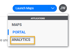
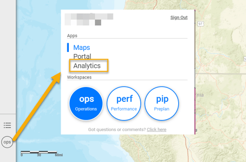
Access the Analytics Dashboards by selecting the Analytics App.
- If you just logged in and are in the Portal, select Analytics in the upper right.
- If you are in the Maps app, select the using the menu item in the lowest left.
Dashboard Menu
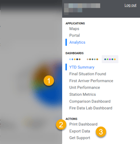
- Select the Dashboard to view.
- Print Dashboard - Print the current dashboard. A Visualization Overview and list of Applied Filters is added as a first page.
- Export Data - Export all records for Incidents and/or Units as a csv file for the date range currently selected.
Filters

- Always look at the default date of the filters. Most default to most Recent Year – which is the last full calendar year. Users can change the date range as desired. There are several built in options, however the option of “Custom” is available, allowing the user to set any date range desired.
- Remember, after selecting your filter options you must hit APPLY for the filters to be applied to the dashboards.
- Each dashboard has a default set of filters based on the data that is interrogated by the dashboard. As a result, not all options are available on all dashboards. Additionally, Intterra can integrate up to 5 shape files that can be used to filter incidents by coordinated, to return only those incidents which occurred in the specified shape.
Chart Aids
- Info - Select for a description of the chart and what its based on.
- Download - Select to
- Print - Prints current chart and legend. Note: Not available for tables.
- Download Chart - Downloads an image file (png) for adding to docs and presentations.
- Export - Exports the aggregated data used to create the chart. This is useful for creating your own version using Excel Charts or other application.
Dashboards
NOTE: The dashboards available for a system will vary based on available data from the client.
YTD Summary
The YTD Summary dashboard provides summary information of basic volume and types of responses for the given agency YTD. This dashboard is always run year to date, thus does not have any date selection parameters. The question this dashboard is attempting to answer is: What is the volume of incidents for my agency this year.
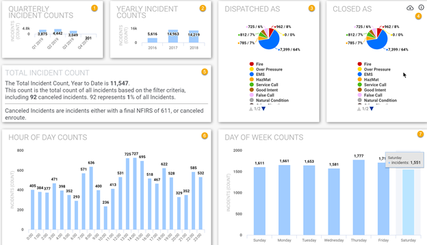
- Quarterly Incident Counts – provides the total number of incidents that occurred within that quarter for the current year. Future quarters will report 0 incidents.
- Yearly Incident Counts – provides the total number of incidents for up to the last 5 full years that data is available (never the current year).
- Dispatched As – breaks year to date incidents down by the Initial NFIRS type. NOTE: Not all RMS systems capture Initial NFIRS – when that data is not available, this pie chart is not displayed.
- Closed As – breaks year to date incident down by the Final NFIRS type.
- Total Incident Count – provides a total count of incidents year to date as well as details out any canceled incidents that are included in that number.
- Hour of Day Counts – Breaks the year to date incidents into the hourly increments in which they occurred.
- Day of Week Counts – breaks the year to date incidents into the day of week on which they occurred.
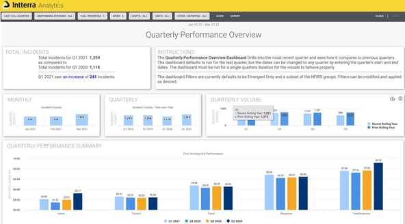
Quarterly Performance Overview
The Quarterly Performance Overview dashboard provides quick comparisons of how the selected quarter compares to the 3 prior quarters, as well as how the selected quarter compares to the same quarter in the prior year.
Final Situation Found
The Final Situation Found dashboard provides similar metrics as the YTD Summary dashboard – except the date parameters can be changed and run for any desired time period. The question this dashboard is attempting to answer is: What is the volume of the incidents for my agency in the specified date range.
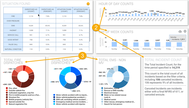
- The Situation Found table provides the same breakdown of incidents based on their Initial NFIRS and Final NFIRS codes as the Dispatched As and Closed As pie charts on the YTD Summary dashboard. NOTE: Not all RMS systems capture Initial NFIRS – when that data is not available, this table still displays but the Dispatched As columns are empty.
- Hour of Day Counts, Day of Week Counts and Total Incident Count – provide the same details as the YTD Summary dashboard, but for the date selection provided on this dashboard.
- Total Fire Dispatches, Total EMS Motor Vehicle (MV) Dispatches and Total EMS – Non Motor Vehicle (MV) – provide a breakdown of incidents by Final NFIRS category, listing up to the top 10 categories for each pie chart.
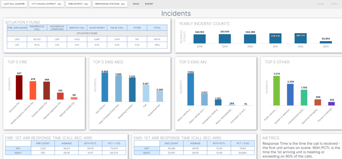
Agency Incident Report
The Agency Incident Report is a simple dashboard designed to make it easy for users to display on a single screen a summary of what has been going on at that agency. Analysts use this report to quickly copy and paste into a presentation, post as an image on an external website, or display on a monitor or projector for a presentation.
First Arriver Performance
For each KPI the dashboard provides the same set of visuals:
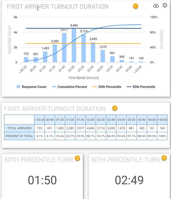
- The Charts illustrate visually how many incident responses fall into each time interval. Turnout starts at < 00:20 (mm:ss), and then the next time bucket is 00:20-00:40, and then 00:41-01:00 etc. The light blue bar visually depicts the number of incidents in each bucket. The count of incidents displays at the top of the bar. The medium blue line illustrate the cumulative percentage….so in this example, at <00:20, represents about 3% of all the first arriver turnouts logged. Then at the next time bucket the total incidents responses are now about 6%, and then at the 01:00 bucket, the total responses represent about 12% of responses. This line will always trend in an upward direction. The orange horizontal line draws a baseline mark at the 50th percentile so the user can visually see where about ½ of the responses fall. The darkest blue horizontal line draws a baseline mark at the 90th percentile, so the user can see the NFPA standard they are striving for.
- Below the chart, the same data is presented in tabular format. This is provided for those to allow users to quickly see how many incidents fall into each interval – some users find the tabular view easier to read than the chart visual.
- and 4. These block calculate out the precise 50th percentile and 90th percentile based on the filters applied.
NOTE: 50th percentile is NOT the same as Average. 50th percentile is the mathematical median, the middle value in a list of numbers. The 50th % is determine by putting every record in line lowest to highest. Say there is 9 records to make it easy: 1, 5, 15, 30, 60, 100, 150, 220, 300. To calculate the average - you would sum all the values - 801 and divide by the count - 9 so 801/9 = 89 The 50th % would be record that sits right in the middle of that list - so in this case 60 - so much different than the 50th %.
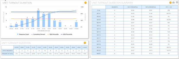
Unit Performance
The Unit Performance dashboard reports out the Turnout and Travel durations for all units that responded to incidents – not just the first arriver. The question this dashboard is attempting to answer is: How well do specific units perform?
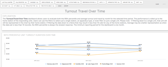
Turnout Travel Over Time
The Turnout Travel Over Time dashboard allows you to track the performance of your stations over a period of time, with the objective of monitoring their performance to see if it is improving or not. The dashboard aggregates the performance by month so it is recommended that the report be run for full month time increments, and for more interesting results, for a time period of at least 3 months. Use the filters on the dashboard to drill into the data to compare similar scenarios. What is the turnout for engines on emergent incidents? Which station is outperforming the others? You can use the filters to drill down to a single unit and evaluate the units performance, however the dashboard results will still display the home station for that unit rather than the unit name.
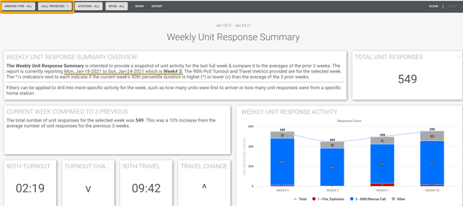
Weekly Unit Response Summary
The Weekly Unit Response Summary provides a snapshot of the unit activity for the last full week and compares it to the average of the prior 3 weeks. The question this dashboard is attempting to answer is: How busy were we last week relative to the prior weeks?
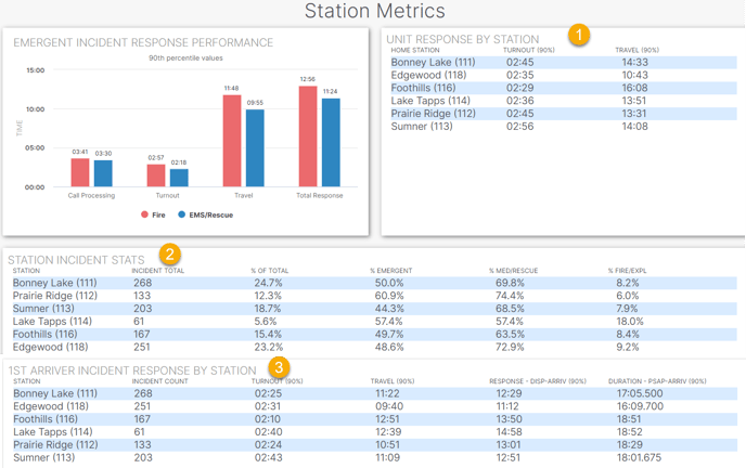
Station Metrics
- The Unit Response by Station graphic reports the performance for each station based on the responses of all units. Use the filters to drill down to the desired results. All other graphics are reporting the performance based ONLY on the first arriving unit.
- The Incident Station Stats reports the breakdown of the incidents by station (as determined by the home station of the first arriving unit).
- The 1st Arriver Incident Response by Station table reports the key performance at the station level based on the performance of the first arriving unit to the incident.